There is some discussion today of grade inflation in the province of Ontario (link). It seems like it’s a real thing to me but I have always wanted to poke around a bit to get some leverage on it. Ontario universities offer the Common University Data Ontario database that publishes a lot of information about Ontario universities, including entrance averages by field of study and by university.
I took the data from 2005 and 2022, which was the last year available and graphed it in a few ways.
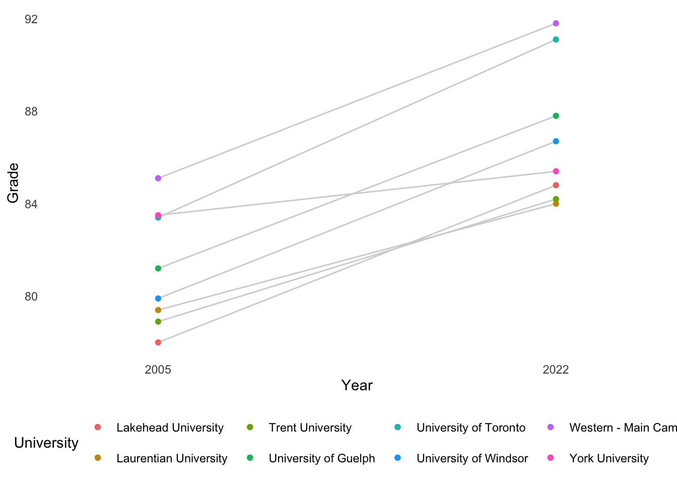
Here is the graph of the overall averages by university. This is the best comparison, probably. Western University and University of Toronto had the highest averages in both years and those grades went up by about eight percentage points, just eyeballing. Interestingly, York University’s entrance average stayed pretty flat.
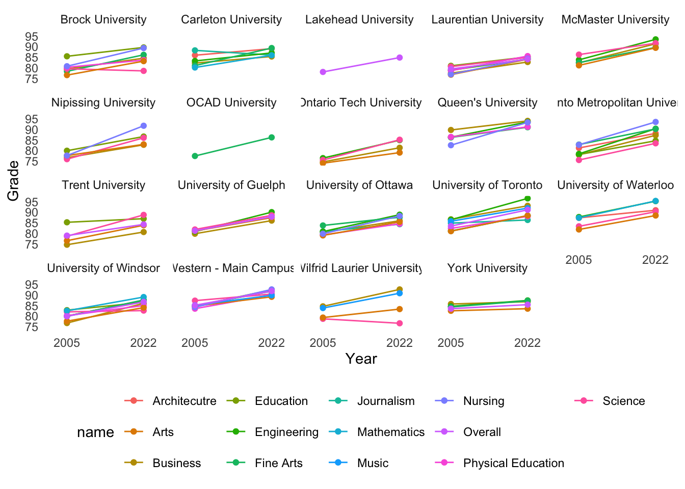
Here is a more elaborate graph that shows grade inflation only by field of study, averaged by university. The only field that seems to be holding the line is mathematics.
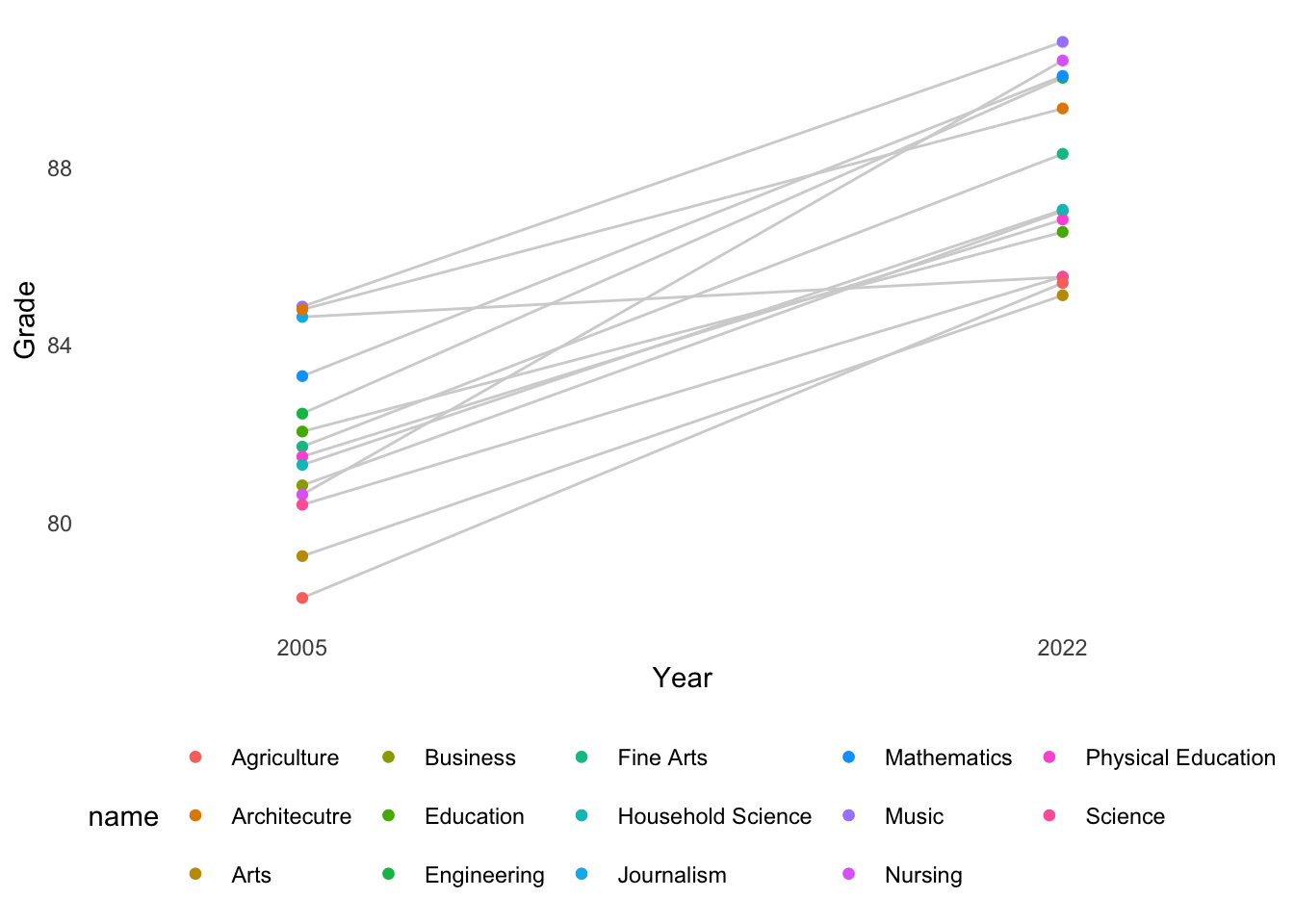
And here is the full plot: field of study by university, excluding agriculture and household sciences because there are so few points.